Unlocking First-Time Users Through In-App Bank Account Creation
How a research-driven insight led a top Vietnamese e-wallet to bring banking directly inside their app — and what happened when that still wasn't enough.
I owned the end-to-end product process: from user research and discovery, to defining requirements with 3 major banking partners, coordinating across risk, compliance, engineering, and business teams, through to post-launch measurement and iteration. UI execution was handled by a dedicated designer I collaborated with closely.
Registered, but never transacted
The app had strong download numbers — but we noticed a specific segment of registered users had never completed a single transaction. The app sat idle on their phones.
The natural assumption was a UX problem. Maybe the onboarding was confusing. Maybe the UI was too complex. But we needed data before we could act.
"Why would someone download a payment app and never use it?"
The question that started everythingGoing directly to dormant users
We ran a mixed-methods study targeting users who had registered but never transacted — combining a broad survey to identify patterns with in-depth interviews to understand the "why" behind them.
The insight we didn't expect
We expected to find UI confusion or trust issues. Instead, the dominant pattern was structural:
"I don't have a bank account, so I can't top up — there's nothing I can do with the app."
A significant segment of inactive users weren't confused. They were simply blocked. Without a bank account to link, the app offered them no entry point. This wasn't a design problem. It was an access problem.
Bring the bank inside the app
Rather than directing users to external banks and hoping they'd return, we designed an in-app bank account creation flow — users could complete KYC verification and open a real bank account without ever leaving the app.
Design principles for the flow
-
01
Minimal steps Every extra screen is a potential drop-off. We ruthlessly cut anything non-essential from the KYC flow.
-
02
Clear progress indicators Users needed to know exactly how far they were from "done." Ambiguity in a financial flow kills completion rates.
-
03
Trust signals at every step Handling personal and financial data requires visible transparency — what we're collecting, why, and how it's used.
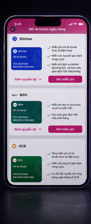
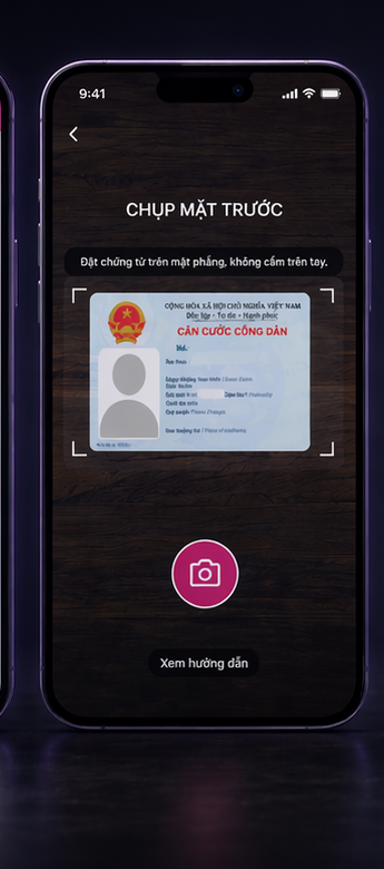
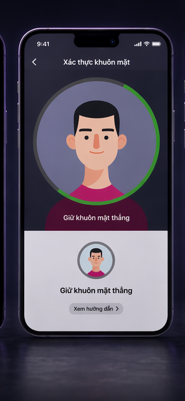
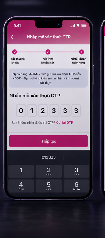
This wasn't just a product problem — it was a coordination problem
Building in-app bank account creation meant navigating a complex web of stakeholders, each with their own requirements, constraints, and timelines.
Solving one problem revealed another
Initial adoption was promising — users were creating bank accounts. But first transaction rates remained lower than expected. Something else was blocking them.
We went back to the data and returned to users for a second round of discovery.
"I created the account, but I didn't really know how to put money into it."
Post-launch user interviewThe funding step was invisible
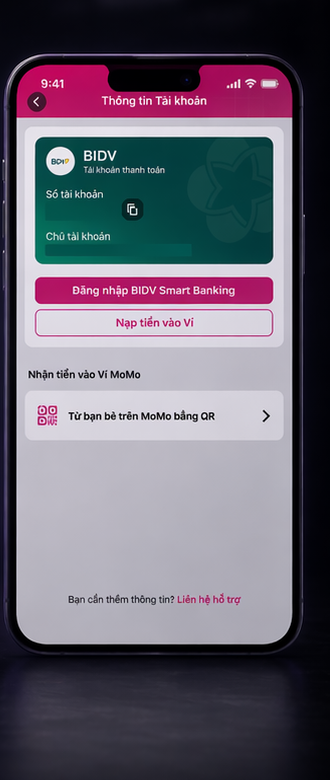
Account creation was working. But the top-up step — funding the newly created account — was buried in navigation. Users finished onboarding and had no clear next action. We collaborated with multiple internal teams to surface the top-up CTA immediately post-account creation, making the path to first transaction obvious.
This required cross-functional coordination across 3+ teams — a challenge as much about alignment and communication as it was about design.
Two iterations. Measurable improvement.
| Metric | Result |
|---|---|
| First transaction rate | Increased significantly after post-onboarding top-up redesign |
| User activation | Grew steadily quarter-over-quarter following both iterations |
| Research approach | Mixed methods (survey + interview) at both pre-launch and post-launch stages |
| Team coordination | Cross-functional collaboration across 3+ product teams |
Activation is a chain, not a single event
The most important lesson from this project wasn't about any single design decision — it was about how to think about user activation as a sequential problem.
Removing barrier #1 (no bank account) didn't complete the job. It revealed barrier #2 (can't fund the account). Real activation work means staying close to the data after launch and being willing to iterate, not ship and move on.
It also reinforced that Product Leadership in a cross-functional environment is as much about alignment and communication as it is about any individual design or research skill.